
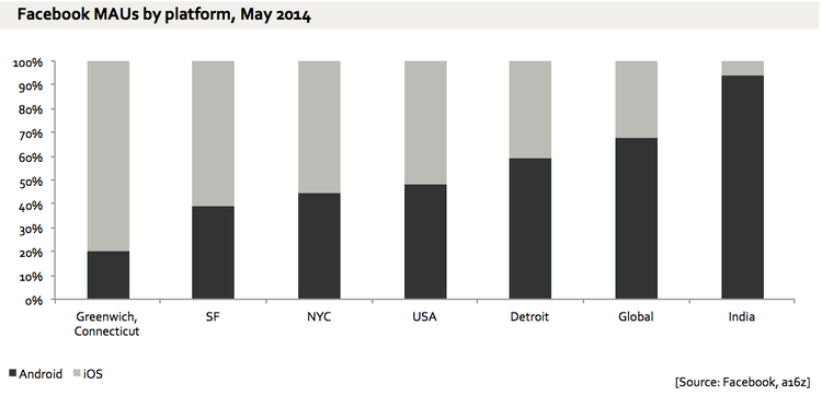
Supposedly, that is. The bar graph originally posted by Andreessen Horowitz analyst Ben Evans shows Facebook’s active users of Android and iOS by region. How does this translate to the idea that Apple is for the rich people?
First, we have to go back to the issue of which has the bigger mobile market share: Apple or Google? Some pundits have even labeled this issue as arguably the most important issue in tech right now. While that is definitely debatable for your average tech analyst, for Apple and Google, that might just be true.
Ben Evans titled his post “Unfair but relevant”. Take a look at the bar graph.
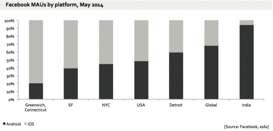
As said, the bar graph compares Facebook’s active users of Android and iOS by region, and obviously, very select regions. Considering that the black parts refer to Android users while the gray parts refer to iOS users PLUS considering the regions, it’s pretty obvious that there are more Android users in the entire world, with India being cherry picked out of all the other countries out there.
At the risk of being un-PC, it’s also pretty obvious that the United States is richer than India. Greenwich, CT, is also known for its well to do population. As for the rest of the world, well, we can’t really deny that there are more poor countries/people than rich, yeah?
So is it fair to say that there are more iOS users in the richer parts of the world than in the poorer parts? Is it fair to say that Apple is for the rich?
It might hurt and sound elitist, but we can’t deny that Apple devices are expensive while Android devices can be found dirt cheap everywhere. While not everyone who has an Apple device may be rich (the definition of rich is another story altogether), Ben Evans’s comparison graph does point to the fact that there is an economic divide, and that one’s choice of device may be an indication.
No wonder iPhones and iPads are such targets of theft.
2 thoughts on “This Bar Graph Shows That Apple Is for the Rich”
just look at that twitter map of tweets from manhatten (virtually all IOS) versus newark (mostly android). same with every major city worldwide.