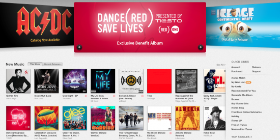
The long-awaited new version of iTunes is here, and it’s pretty sweet. Let’s take a look at what’s new.
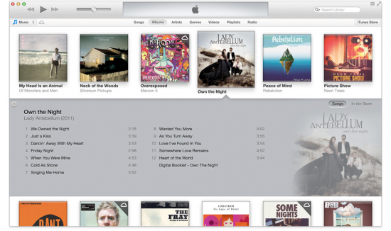
New functions have been built in to the music player software, greatly streamlining everything and making it simpler and more intuitive. I love the way the music album view splits to show you album details, and the new tiny player is a great example of Apple’s elegant design philosophy in action.
Now I like music as much as the next guy, but I primarily use iTunes for finding and downloading apps. The App Store now looks identical to the upgraded App Store app on your iPhone or iPad. Overall, everything scrolls sideways now more than vertically, so collections of apps now appear on a single page, instead of multiple pages. Search seems to be much faster, too, though I haven’t used it enough to speak to its accuracy.
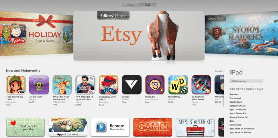
Design enthusiasts will appreciate the slick new coat of paint the whole app has gotten. While it’s not a radical transformation, it really is a whole new design, as every single element has been changed. It’s mostly subtle stuff, but it makes a world of difference, because everything feels cleaner and less busy. I particularly like how the buttons like the “Buy” button are much bigger and clearer. And a very long overdue change is the addition of full-featured home pages for every category in the App Store. This gives all of iTunes a nice, unified appearance, since every home page — from Movies to Podcasts to iTunes U — shows the exact same interface.
When syncing your iDevices, you’re presented with a lot more options than before, allowing you to tweak almost every setting on your device right from your Mac. The customization options here are impressive, and file management between the two seems easier than before.
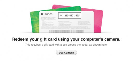
One of the niftiest new features is found when you go to redeem a gift card. You can still enter the code from the back of the card, but there’s a new option: you can use your Mac’s FaceTime camera to let iTunes scan your gift card. You just hold your gift card up in front of the camera, and iTunes reads it from there, saving you the hassle of typing in the code. Neat. But it only works with the latest gift cards, which feature a code number outlined with a black box.
There’s even a new iTunes icon, though it’s not as radical as the last redesign. The black-colored notes have been replaced with a gradient gray, and the background blue color tweaked a little.
I haven’t finished exploring everything iTunes 11 has to offer, but so far I’m fairly impressed.
What are your thoughts about the new iTunes?


